Holiday Card 2020
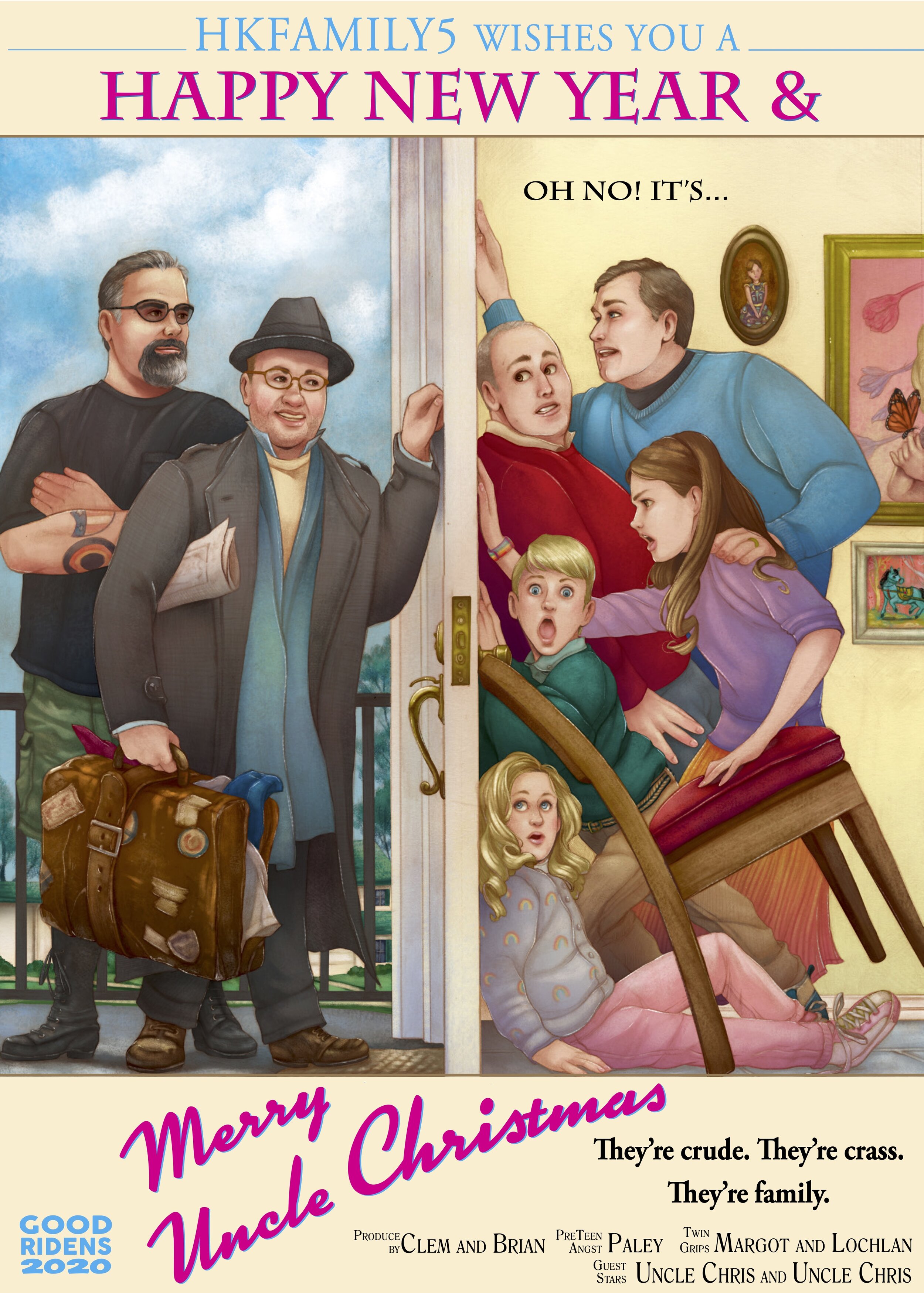
Get it! Merry Uncle CHRIStmas! This holiday card has been brewing in my head since 2012 and I’ve been trying to make it happen the last two years. This was the year! I was lucky enough to have an awesome artist take on the challenge. Josh Dunbar was actually a Instagram find about two years ago. I have been following him because of his talent to breathing new life in to the Golden Girls and lifting them up onto social media. The card design is a homage to wonderful holiday classic movie, UNCLE BUCK. This was the first major film hit for Macaulay Culkin, the following year Culkin starred in Home Alone. The one liners and banter dialogue is legend in this film. My goal was to recreate the classic movie poster, showing John Candy (Uncle Buck) knocking on this family’s front door.
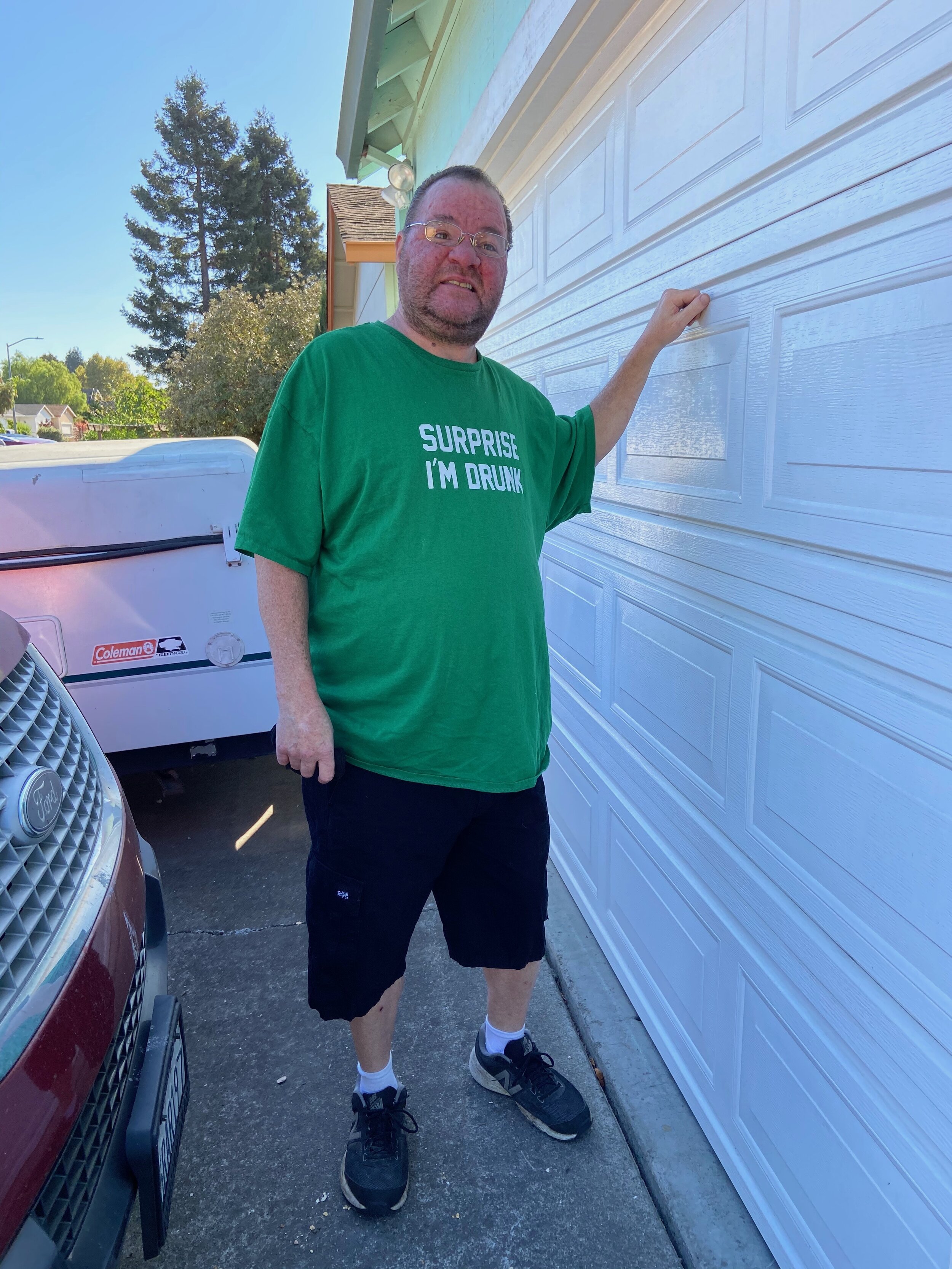
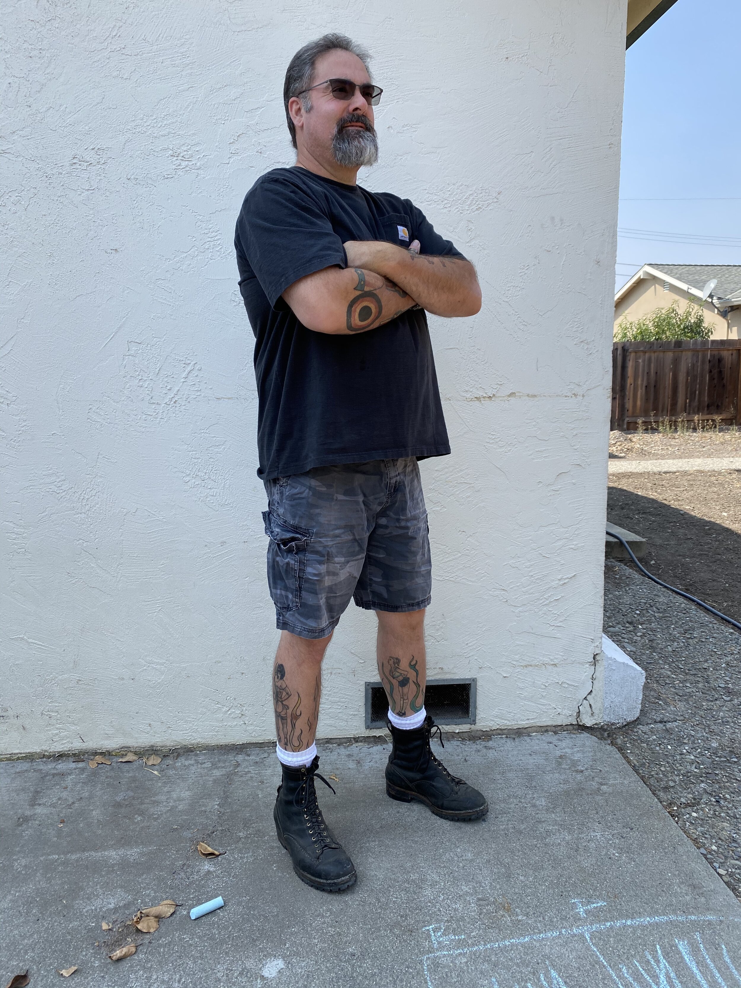
This idea of utilizing my brother Chris and Clem’s brother Chris was a perfect fit. Now officially I did get verbal authorization from both uncles on the idea and the branding of them as Crass and Crude, which both of them replied. “Yah that’s me”. I think I have been asking artists to do this homage to Uncle Buck for at least 5 years now. Josh was game! This image turned out great and I am especially appreciative of the detailing he added to the piece. From my brother’s tattoo’s to kids portraits hanging on the walls inside the house.
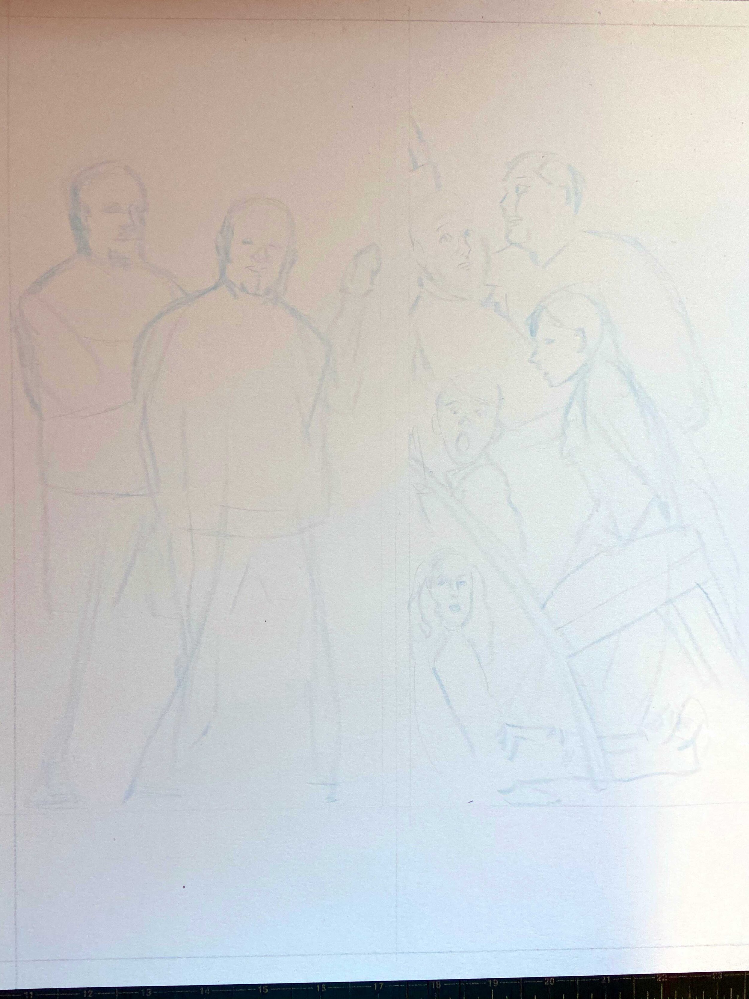
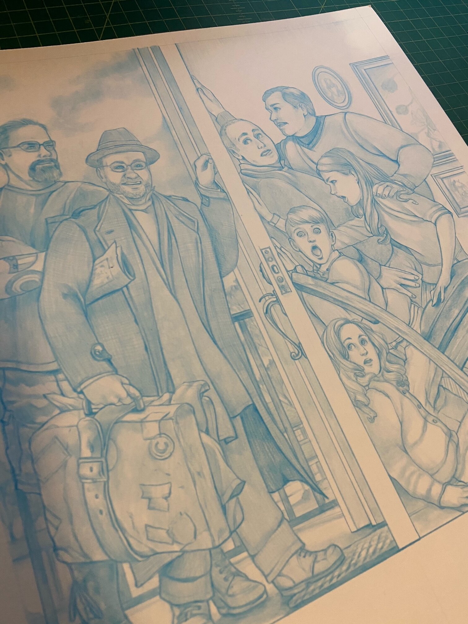
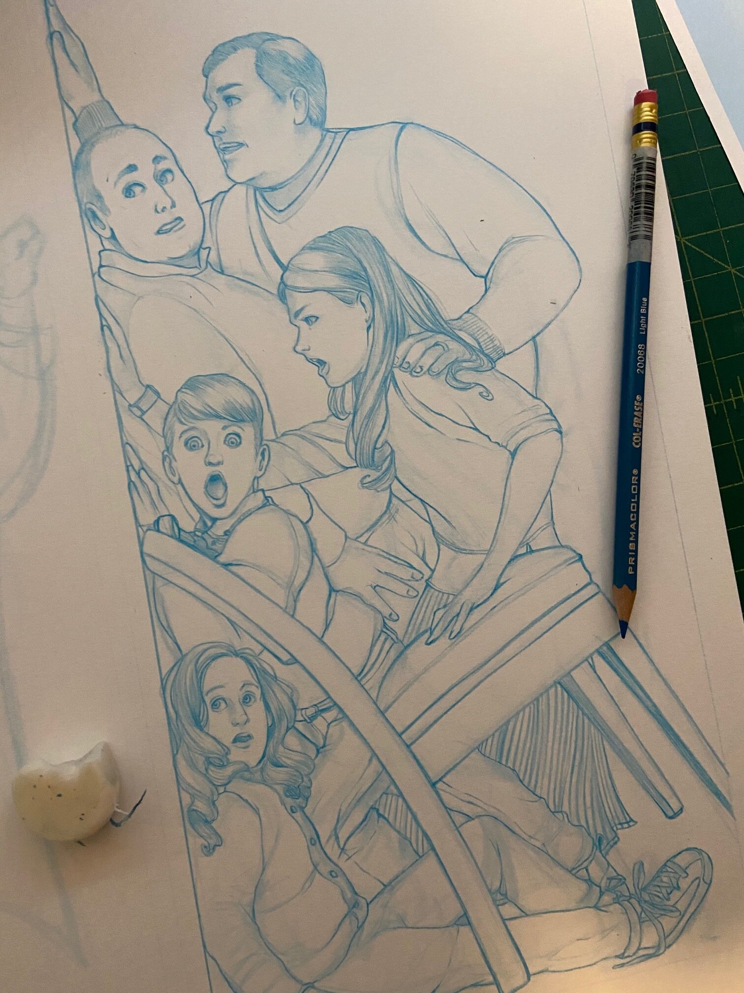
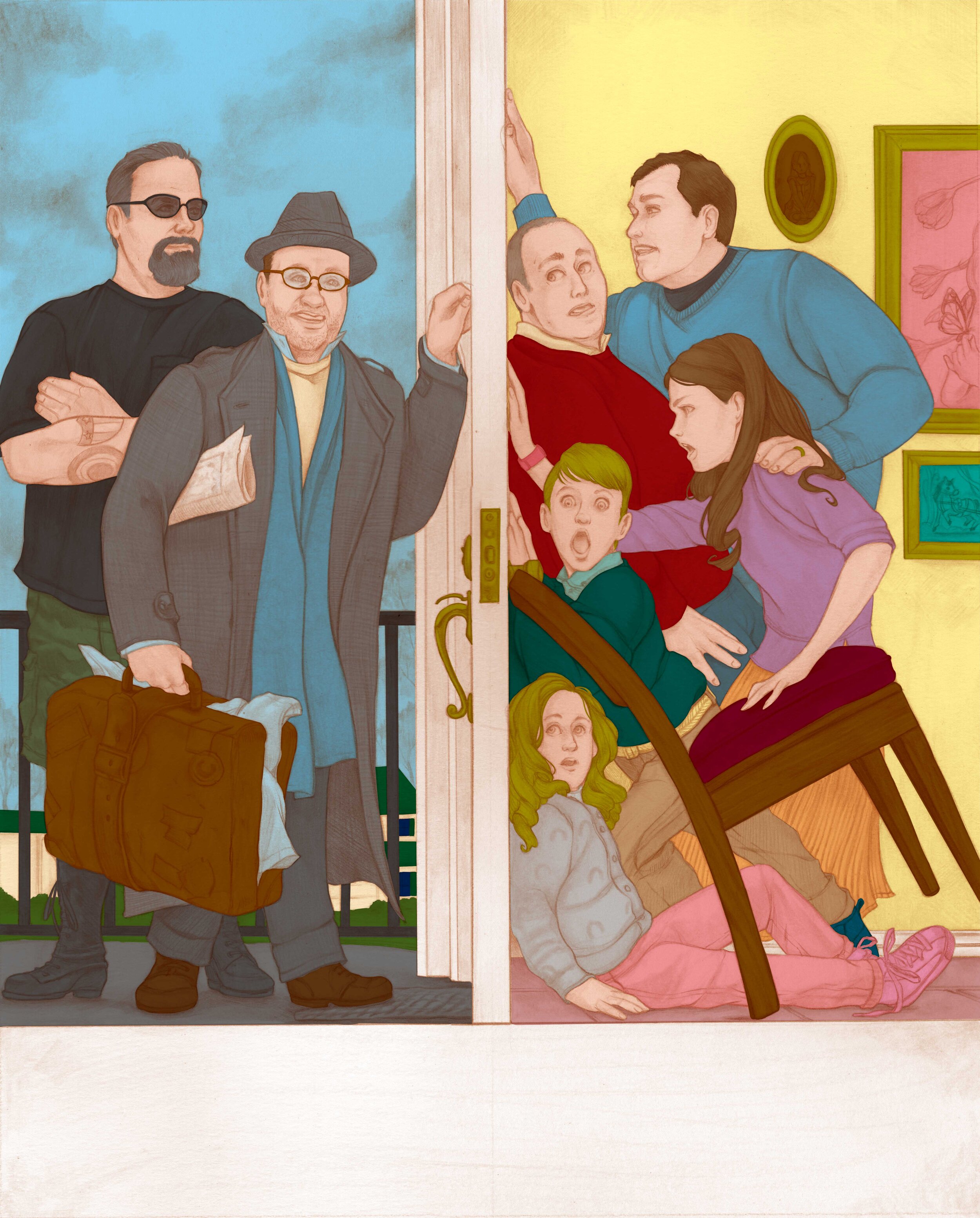
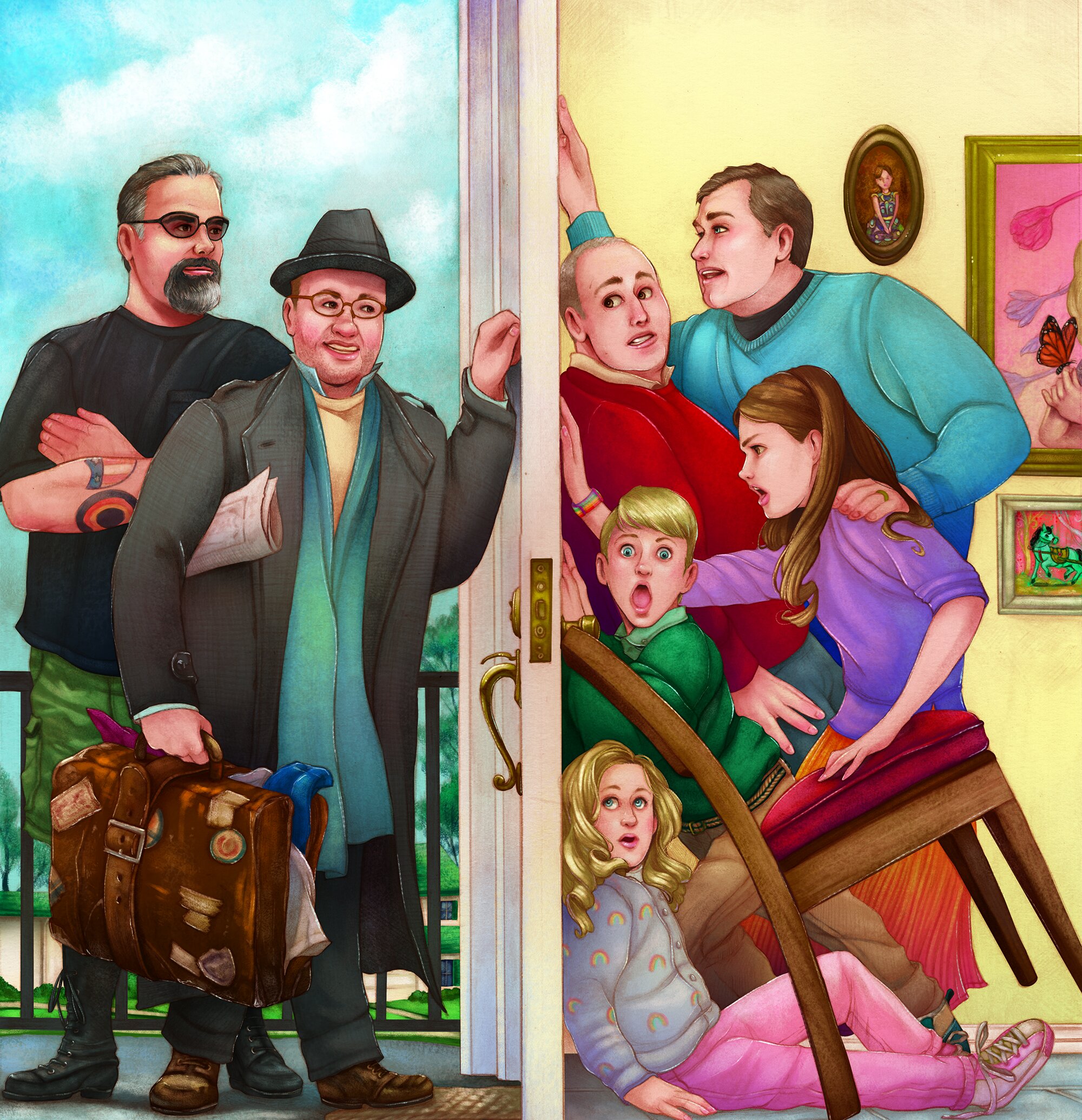
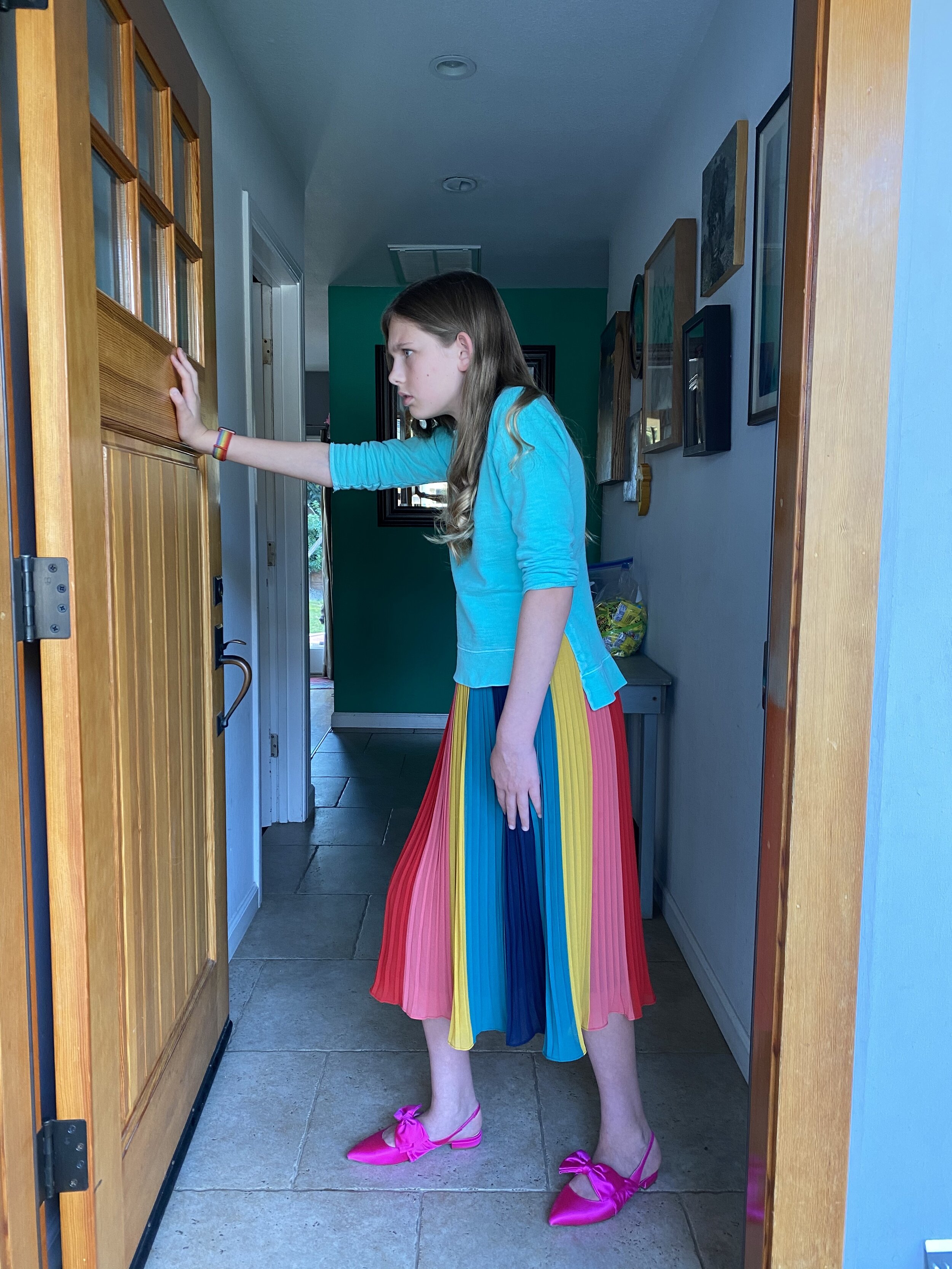
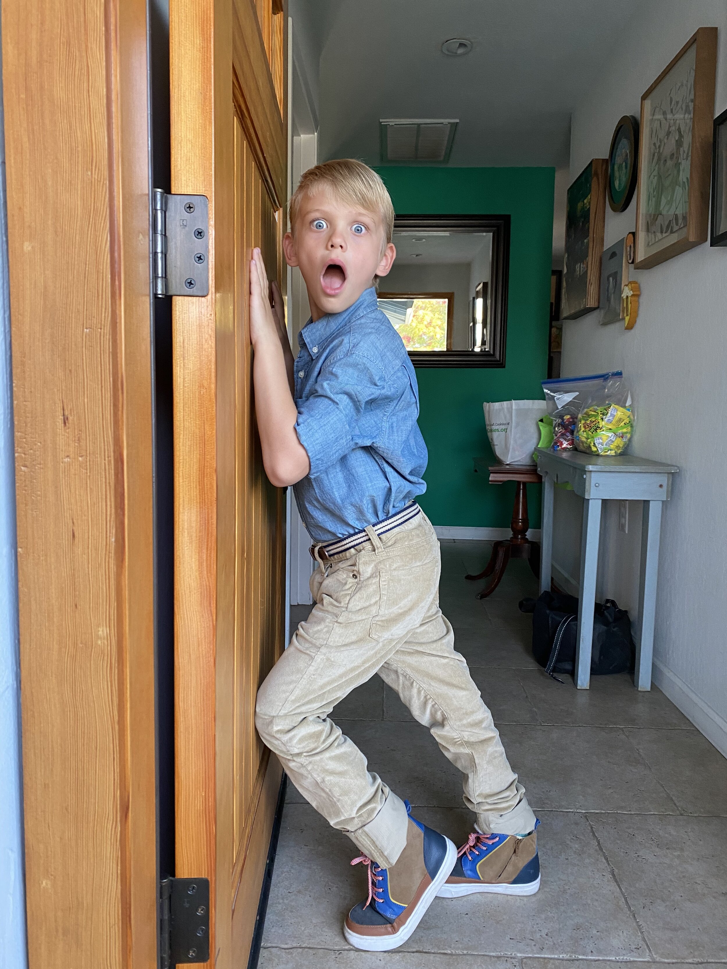
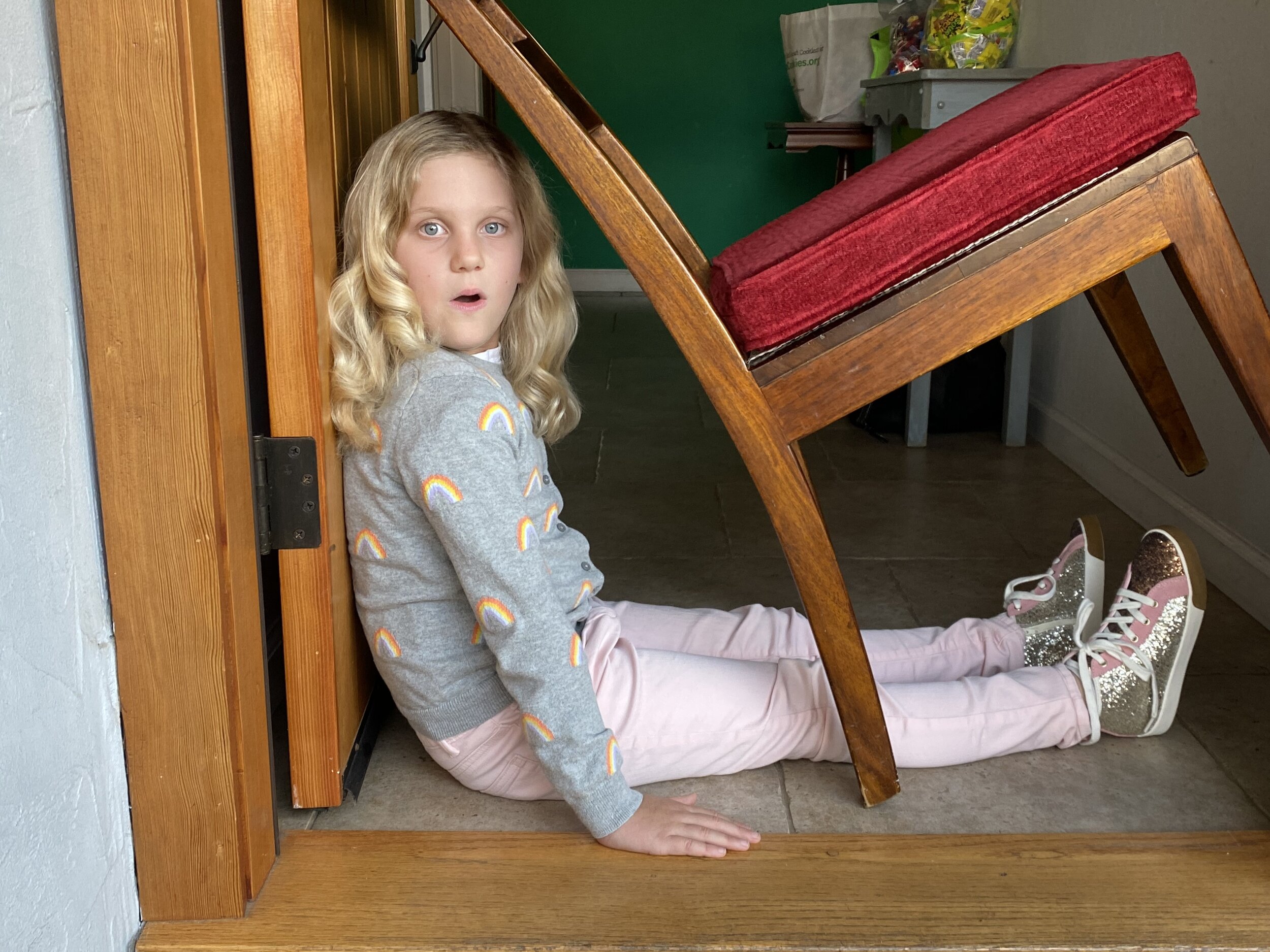
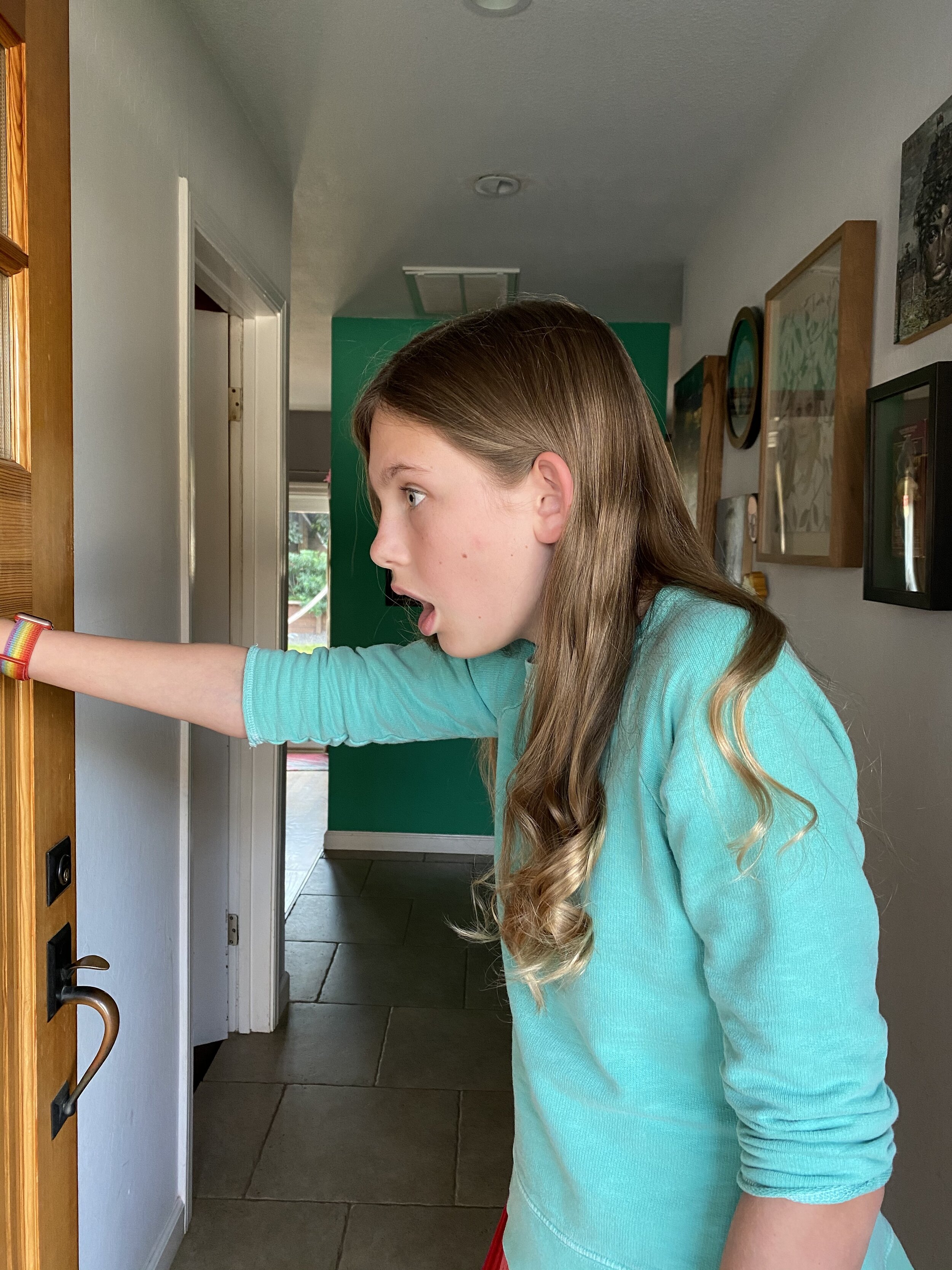
The process was fun for the kids to watch. Josh starts from a blue pencil sketch and opted to do the coloring and detail work digitally. As you can see from the gallery of progress shots that he shared with us. The piece really evolves. I had taken reference shots of all of us, including the uncles. Josh really gave us all a great cartoon quality in his piece. My favorite part were the kids faces. Their expressions were captured perfectly in the final piece. One thing we both played around with together was the card design. Also included were two versions of the final card design. I found the original movie font colors to be more red and blue, then there was a shift of the colors being a brighter neon blue and hot pink. In the end I opted for the more 80’s color scheme with the hot pink.
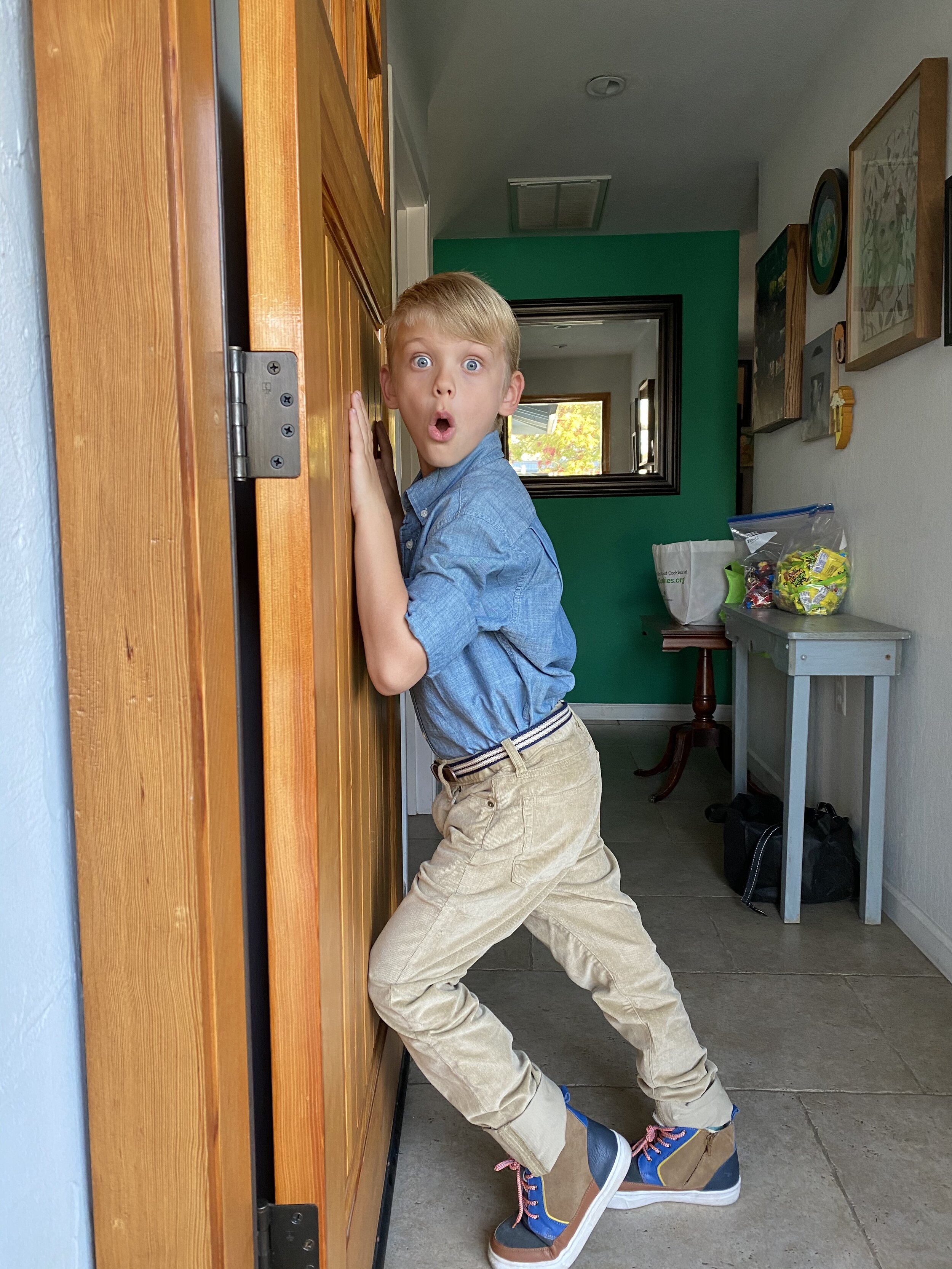
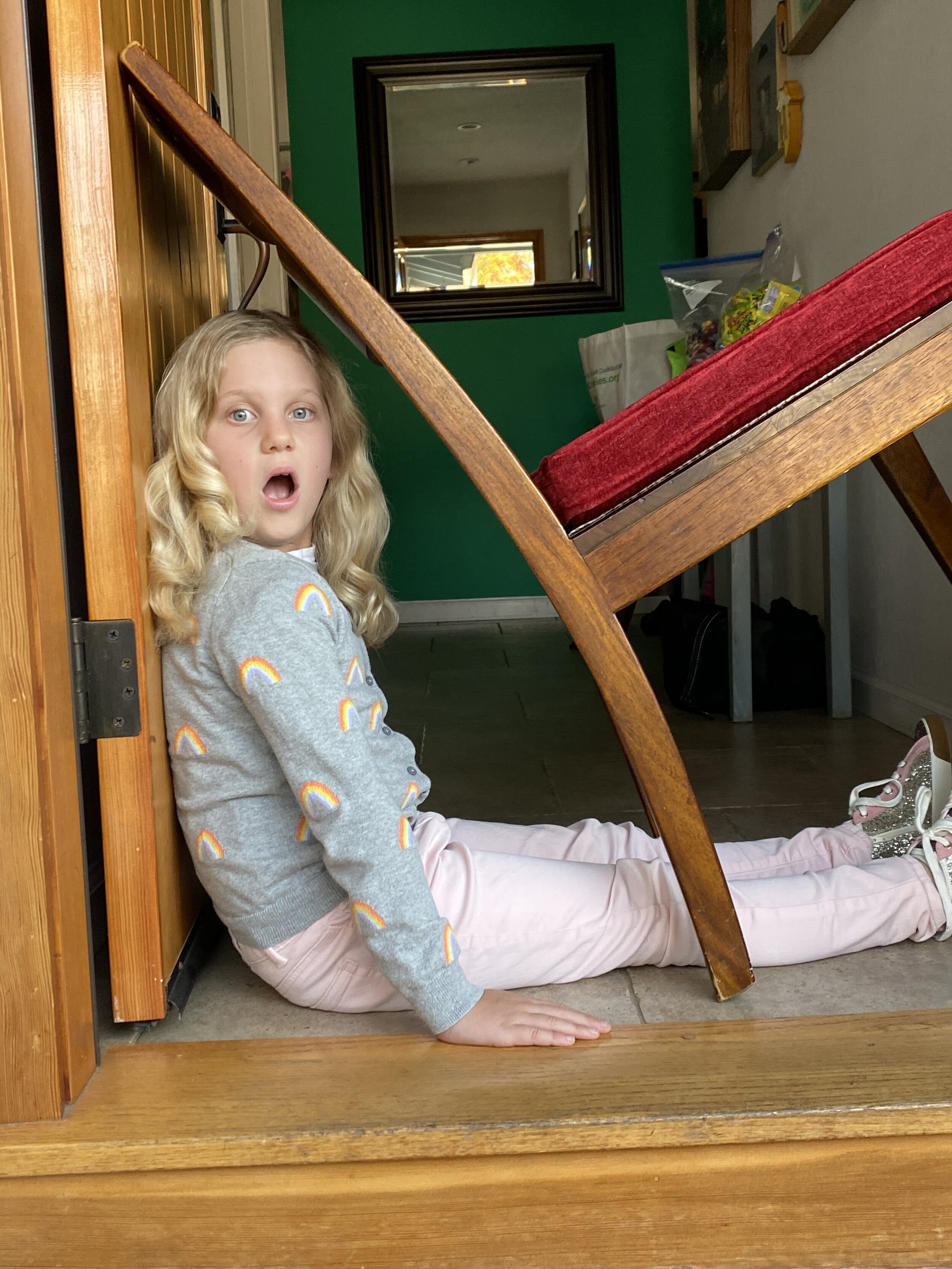
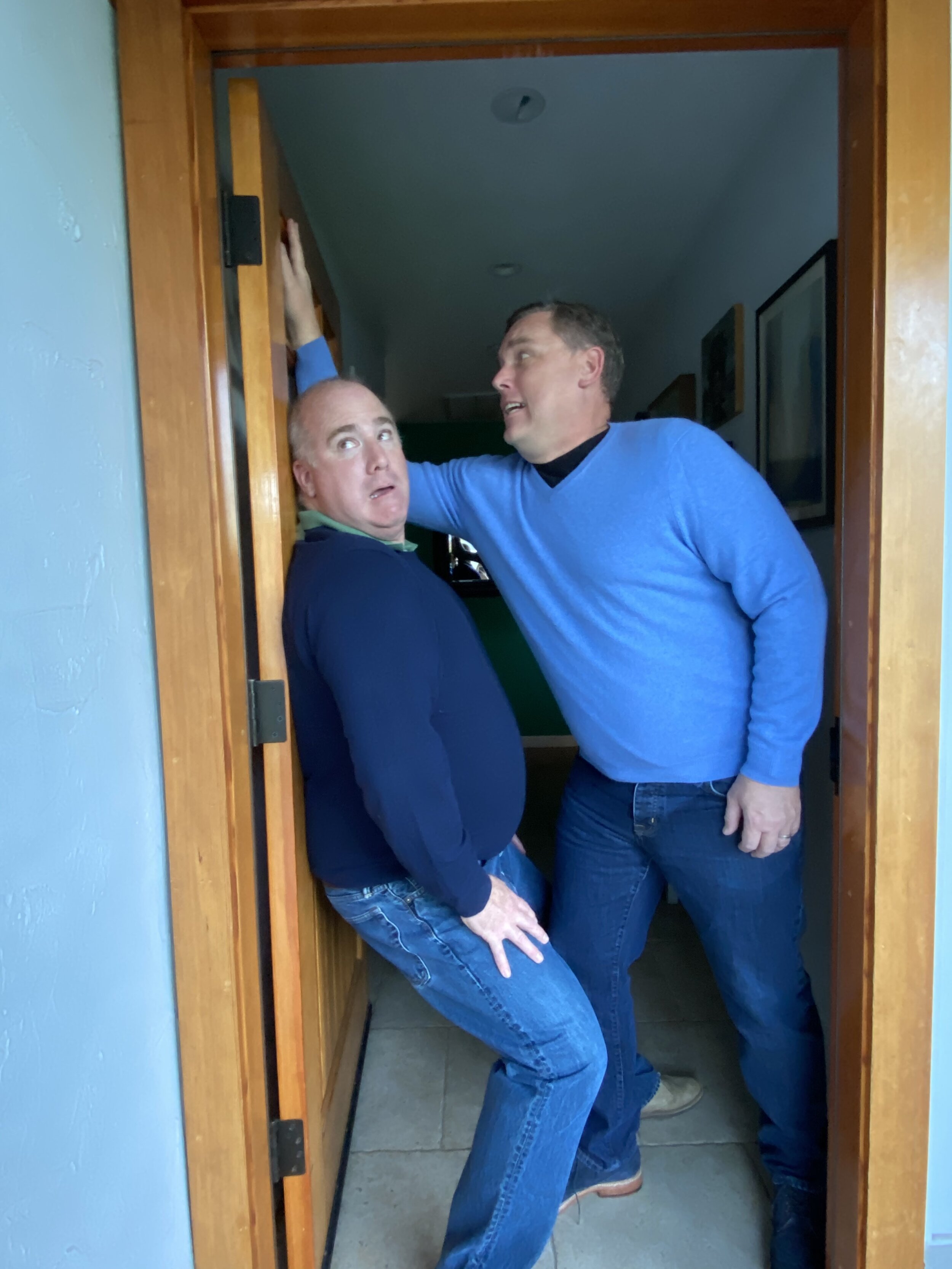
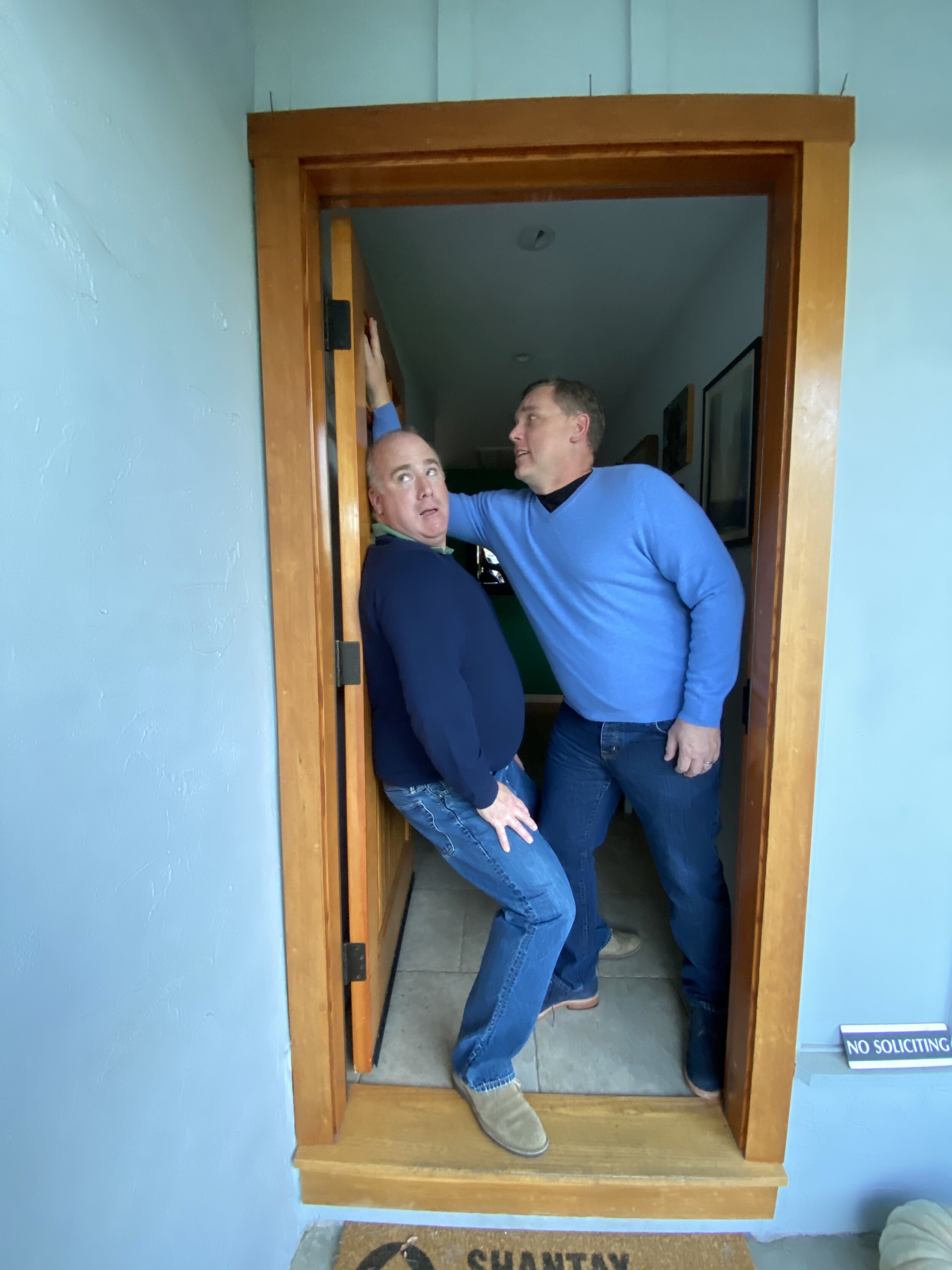
The reference shots are pretty hilarious. The kids had a lot of fun posing at the front door. Clem and I on the other hand were contortionists trying to get the pose right. I am not sure how that mother got her head to turn like that, leaning in that position. Another great detail was Josh’s choice to keep my brothers dark glasses on. The final result was a flawless rendition of him in the image. You can faintly see his eyes, just like in the reference photos. I worked on the overall design of the card in Adobe Indesign and created all the font design in Illustrator. I tried my best to keep with the original design of the movie posted. The labeling and wordage is all pretty close to the original.
I am super proud of this card and I hope everyone enjoyed it. This card is a perfect end to a pretty fucked up year. I think most people understood the reference. Some I had to say UNCLE BUCK and then I got, “ooh yah”. My ideas are out there, and most don’t get them. For example our holiday message by the famed Jaclyn Smith (Charlies Angels) went over a few peoples heads. All in all, I am proud of this card, It’s not everyones cup of tea but it’s ours. My idea list is still pretty long for holiday cards. I am just happy I got to strikethrough one of those ideas. Still hunting for the costumes for the Liberace vs. Elton Card. Maybe 2021 will be that year!